Time Series Scalar Plot
Time-series scalar plots are described here. Scalar data is defined as one-dimensional data where there is one measurement for every time stamp. This definition includes all scalar sensors, such as temperature, on both stationary and mobile platforms such as Wally (a crawler in Barkley Canyon) or the Vertical Profiling System (VPS). Multi-dimensional data from instruments like multibeam sonar, hydrophones, video cameras and other complex instruments are excluded. For 'Instruments by Location' and 'Variables by Location' data searches, data from multiple device deployments will be combined when they are compatible, so that users will see a single continuous record even though multiple devices/sensors contributed that data. Plots are available for all sensors on a device or variables by location search tree node or on a per sensor basis.
Oceans 23.0 API filter: dataProductCode=TSSP
...
| Include Page | ||||
|---|---|---|---|---|
|
...
...
Sensors to include
...
Plot Types
Plot types are determined by the resample type and whether the plot is device-level (multiple sensors) or sensor-level. Sensor-level plots provide more detailed data, options and metadata for individual sensors, while device-level plots provide an overview and comparisons between sensors.
...
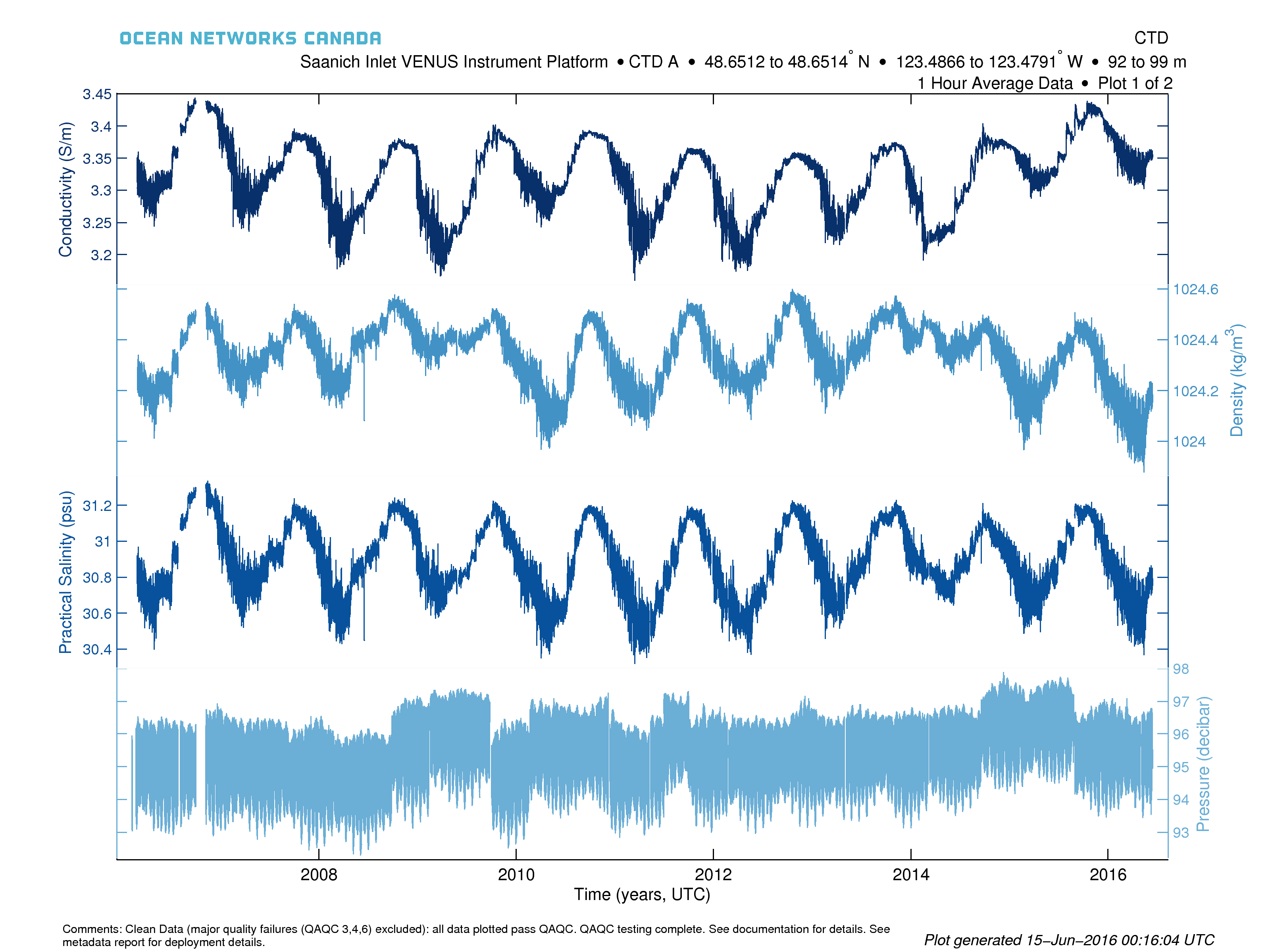
Device-level or multi-sensor plots consist of multiple sub-plots, each with independent Y-axes and a common time axis. Each plot can have up to 5 sensors as sub-plots and if there are more than 5 sensors to plot, additional plots will be created, all with the same time axis (if the PDF format is selected, plots will be multiple pages within the same PDF file). Data is plotted as a simple line plot with alternating hues of blue colours to distinguish the sub-plots and Y-axes. Sensors are ordered alphabetically. Comments below the plot provide QAQC information. Here is an example (instruments by location search, one hour average):

...
| Include Page | ||
|---|---|---|
|
...
State of:
...
|
...
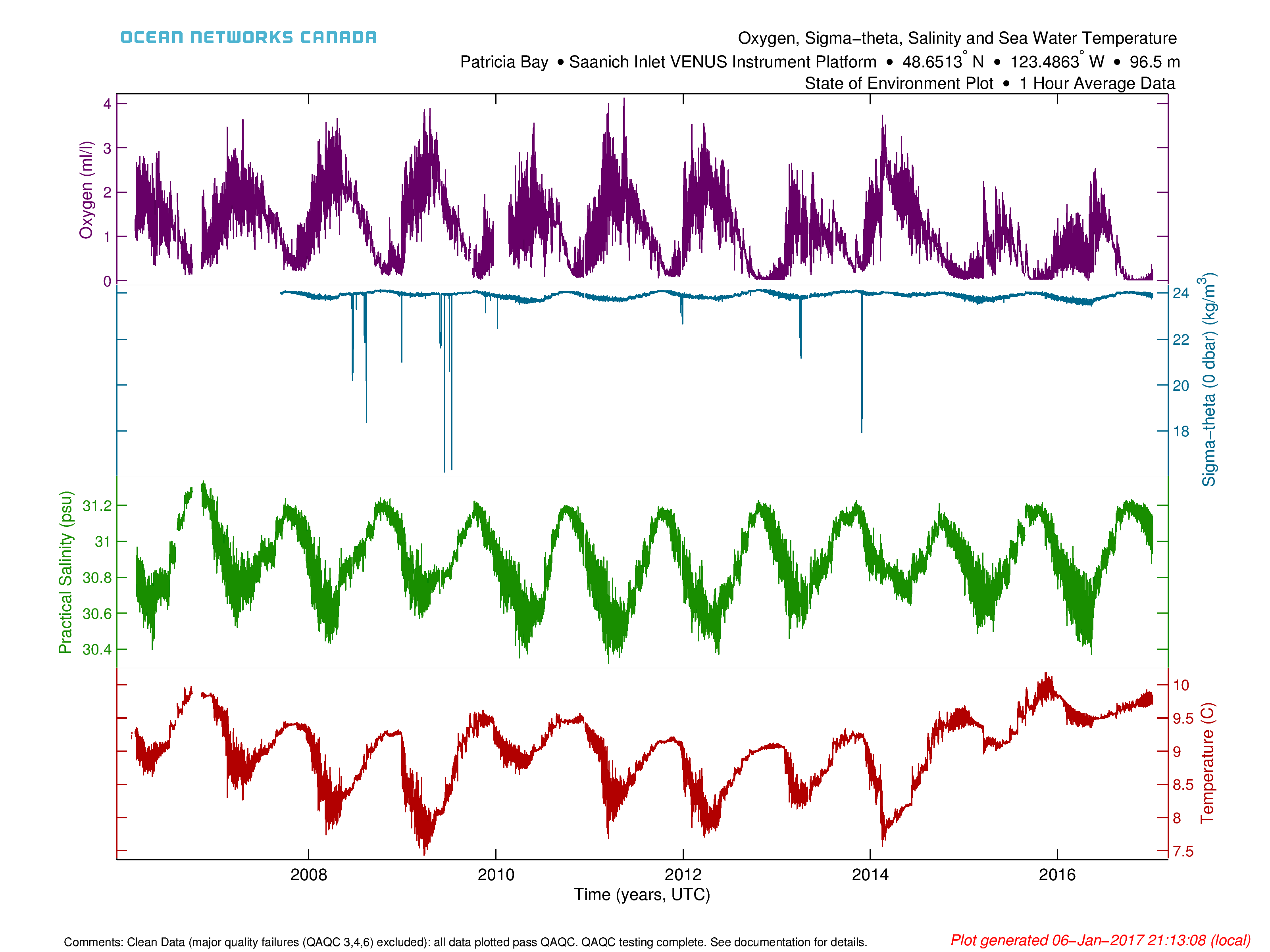
Here is an example State of Ocean plot for the Saanich Inlet VENUS Instrument Platform. Please note that this test file and not to be used scientifically (we have yet to fully clean and reprocess the Sigma-theta data).
State of Ocean and Environment Climate and Anomaly Plots
These plots are based on the same information/configuration as the original State of Ocean/Environment plots, except that they use daily min/max + average data. These plots are available in Data Preview alongside the originals. Here are some examples from our testing environment:


The anomaly plot (left) shows a time series of daily averages coloured on whether the value for that date is above the 66 percentile (red) or is below the 33 percentile (blue). The climatology plot (right) shows the day of year data for each sensor, showing the seasonality of the data. The grey lines in this plot are daily averages, while the black lines are the overall daily averages computed from the daily averages. The red and blue lines are the 66 and 33 percentiles calculated from the daily average for each day of the year (this data is also used in the anomaly plot). Green lines are this years' daily averages. Leap days are excluded from the climate plot and the day of year averages. The percentiles aren't showed if there is less than 3 years of data on each date, so the anomaly plot maybe empty for new deployments and the climate plot may omit the red and blue lines.
The data behind these plots are available via links on their display in Data Preview. The file data products (CSV, MAT, ODV) are as documented in time series scalar data products, with the exception of the MAT file, which contains an additional structure called 'dataClimate'. 'dataClimate' is a copy of the 'data' structure, excluding non-climate sensors and replacing the min/max+avg values that exist in the 'data' structure with additional calculated values:
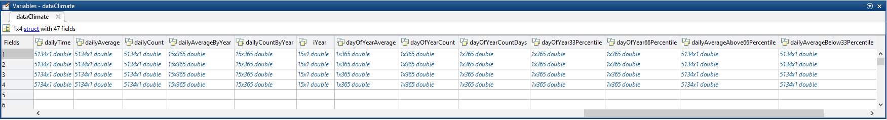
dailyTime, dailyAverage, dailyCount are copies of time, average, count in the normal 'data' structure, but are added in case the data is calculated from hourly or other data (currently we use daily data, so this step is a pass-through). The dailyAverageByYear, dailyCountByYear are a reshape of the dailyAverage and dailyCount data into a matrix that is year by date, where the year is specified by iYear and the date is 1 to 365 (leap days excluded). dayOfYearAverage, dayOfYearCount, dayOfYear33Percentile, dayOfYear66Percentile are the day of year statistics for each of the 365 years of the year. The dayOfYearCount is the count of the raw readings on that day of the year, whereas dayOfYearCountDays is the number of days that have data. So for the 15 years of Saanich Inlet, if only 5 years have data on a specific day, that dayOfYearCountDays value is 5, but dayOfYearCount will be ~400000 readings. dayOfYearCountDays is used to determine if there is enough data (minimum 3) for a valid percentile calculation. dailyAverageAbove66Percentile, dailyAverageBelow33Percentile are the values used the anomaly plot, so that they are daily time series of the same size as the daily average data, and their values are either the dailyAverage or NaN if they are not above/below the percentile. The anomaly plot is then simply:
| Code Block |
|---|
hold on;
plot(dailyTime, dailyAverage)
plot(dailyTime, dailyAverageAbove66Percentile, 'r')
plot(dailyTime, dailyAverageBelow33Percentile, 'b') |
so that the red/blue colouring goes over top of the black daily average.
| Anchor | ||||
|---|---|---|---|---|
|
...
The default sensor-level plot is the Min/Max + Average with Automatic resampling. This is the same default approach that Plotting Utility uses.
...
Plots are available in PNG and PDF format. Basic metadata information is included in the titles. Note that the logo in the PDF product may appear 'fuzzy' in some viewers, see the PDF page for more details. See the mobile device page to see how these data products handle data from mobile devices.
Oceans 23.0 API filter: extension={png,pdf}
...