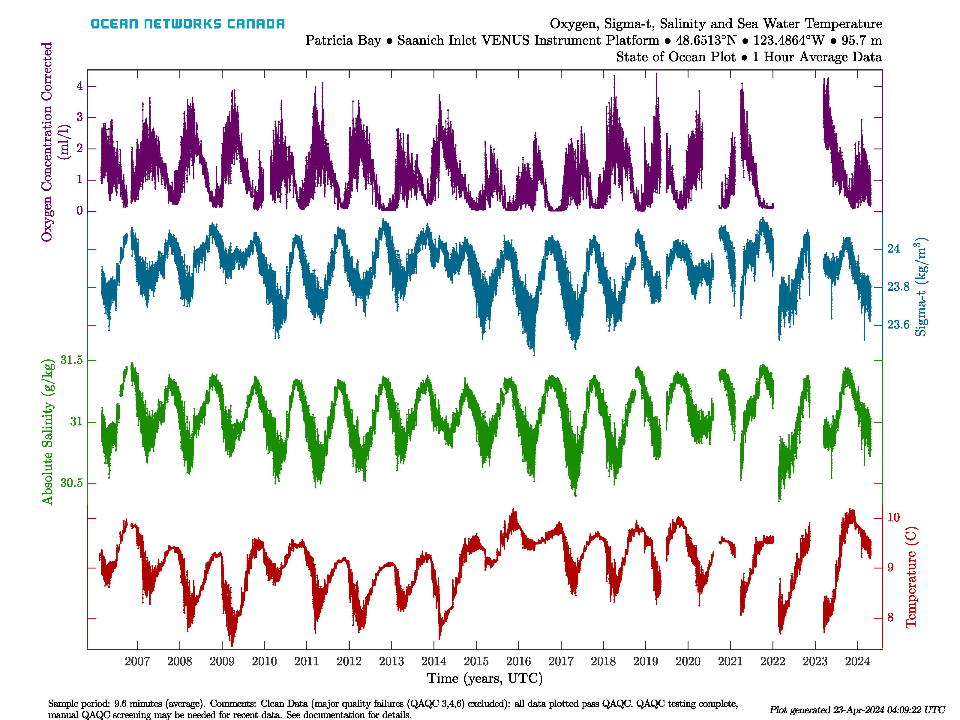
State of Ocean and Environment Plots
State of Ocean and Environment plots are designed to give a long-term overview of state variables for either the Ocean or Atmosphere. These plots appear on the website and on the Data Preview tool. They are equivalent to a 'Variables by Location' search with 'All Available' time range, 1 hour averaging for the four or five variables put together into one search request. These searches are run on a schedule, usually once per day. State of Ocean/Environment plots are essentially device-level time series scalar plots, but have a specific colour scheme, as follows:
Sensor Type | Colour | State of: | Sensor Type | Colour | State of: |
|---|---|---|---|---|---|
Sensor Type | Colour | State of: | Sensor Type | Colour | State of: |
| Sea Temperature | Red | Ocean | Air Temperature | Red | Atmosphere |
| Salinity | Green | Ocean | Barometric Pressure | Green | Atmosphere |
| Sigma-Theta (0 dbar) | Blue | Ocean | Solar Radiation | Blue | Atmosphere |
| Oxygen Concentration | Magenta | Ocean | % Humidity | Magenta | Atmosphere |
| Ice Draft | Orange | Ocean |
Here is an example State of Ocean plot for the Saanich Inlet VENUS Instrument Platform:
State of Ocean and Environment Climate and Anomaly Plots
These plots are based on the same information/configuration as the original State of Ocean/Environment plots, except that they use daily min/max + average data. These plots are available in Data Preview alongside the originals. Here are examples from Saanich Inlet, the climate plot on the left, anomaly plot on the right:
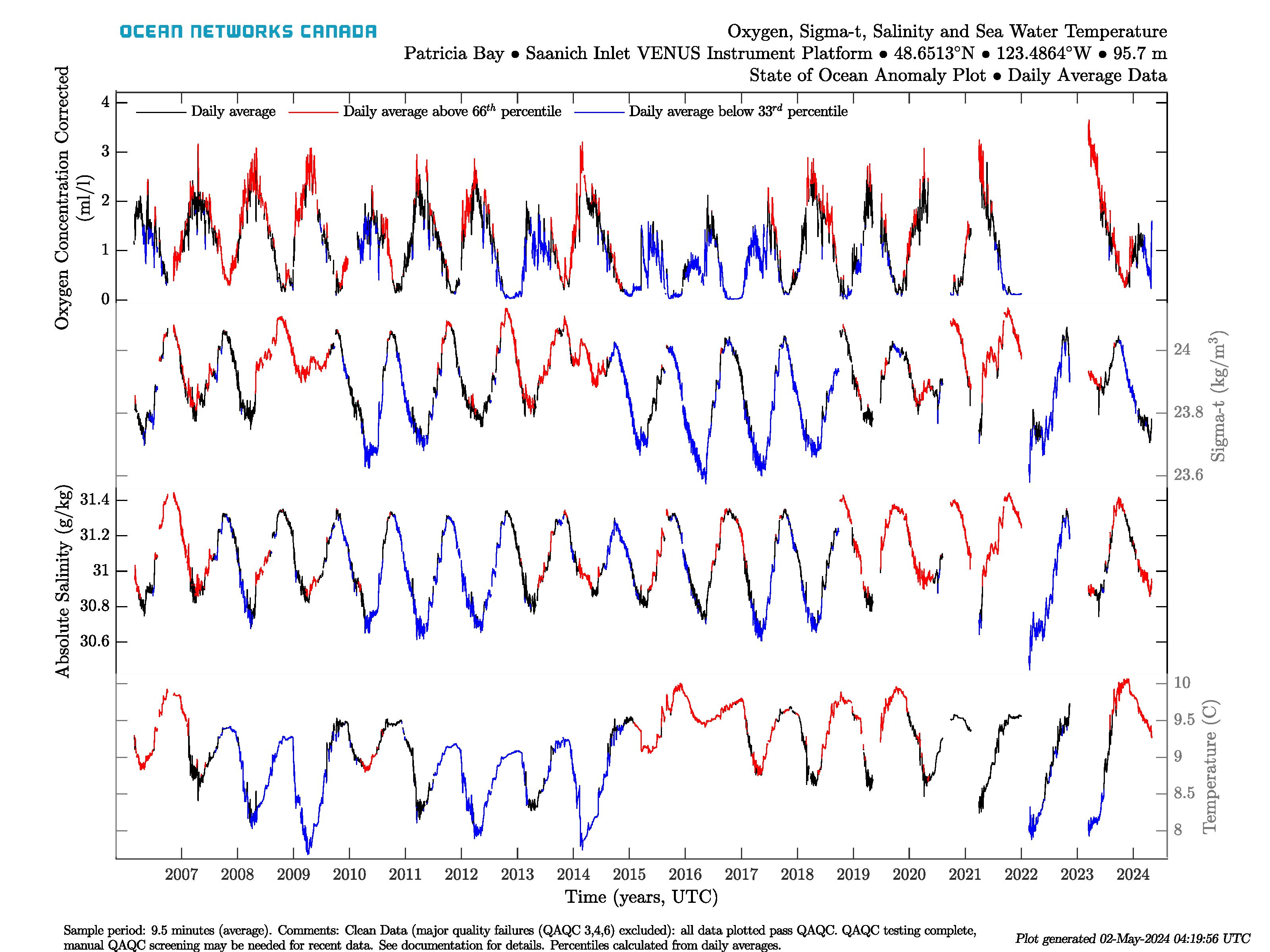
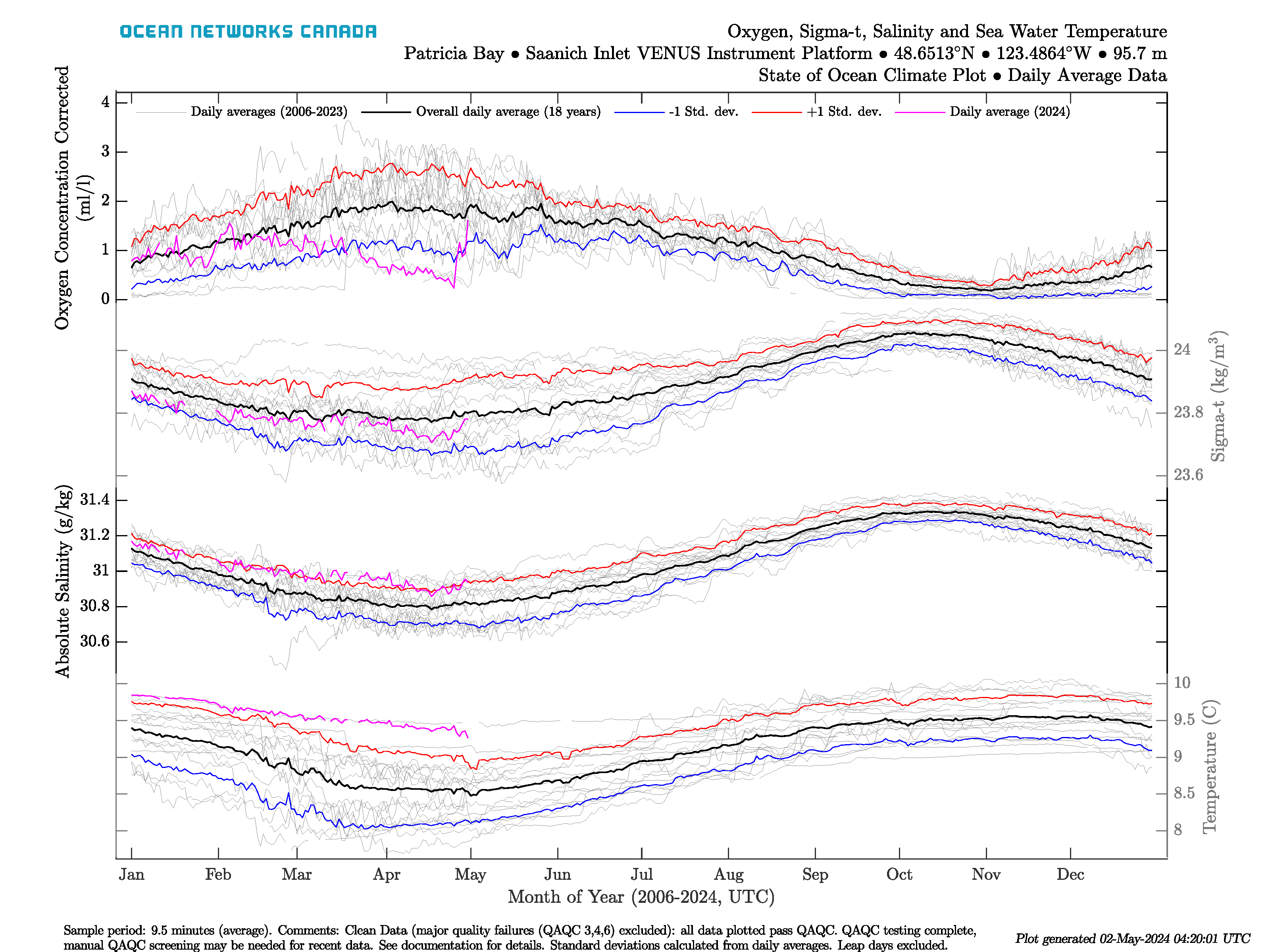
The anomaly plot (left) shows a time series of daily averages coloured on whether the value for that date is above the 66 percentile (red) or is below the 33 percentile (blue), where the percentiles are calculated from daily average values for that day of the year. The climatology plot (right) shows the day of year data for each sensor, showing the seasonality of the data. The grey lines in this plot are daily averages from every year, while the black lines are the overall day of year averages computed from the daily averages. The red and blue lines represent the day of year average plus and minus 1 standard deviation, respectively. Day of year standard deviation is also calculated from the daily averages from each day of the year. The magenta line is the current years' daily averages. Leap days are excluded from the climate plot and the day of year averages. The percentiles and standard deviations aren't showed if there is less than 3 years of data on each date, in that case, the anomaly plot will only show daily averages as black lines, the climate plot will omit the red and blue lines and comments will be added to the plots to indicate that this has occurred (it's common for new deployments).
...