What is it?
Plotting Utility is an interactive plotting tool. Use it when you want to interact with your scalar data; zoom in, change from Min/Max to , or stack multiple sensors in the same timeline. You can change from line charts to bar charts, filled area, and multiple Y-axis plots.
Why is this useful?
It's convenient (no downloads or specialized software required). And with an Oceans 23.0 account you can save your plots to your personal folder and share them with colleagues.
Register an Oceans
23.0 account & get more features
Personal history - remember searches, save plots, create annotations.
Share: send plots to colleagues and friends.
Community: join research working groups, share ideas for experiments and data analysis.
| Panel | ||||||||||||
|---|---|---|---|---|---|---|---|---|---|---|---|---|
| ||||||||||||
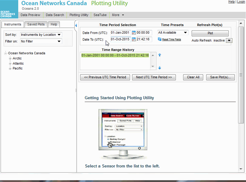
Plotting utility is arranged into three panes: on the left is the navigation and filter pane, on the top right is the time selection and plot history, and the bottom right is where plots appear. (click to enlarge) |
| Panel | ||||||||||||||
|---|---|---|---|---|---|---|---|---|---|---|---|---|---|---|
| ||||||||||||||
|

| Panel | ||||||||||||
|---|---|---|---|---|---|---|---|---|---|---|---|---|
| ||||||||||||
 When you find a pair of plots you would like to compare in an overlay plot, right-click on the sensor name. |
| Panel | ||||||||||||
|---|---|---|---|---|---|---|---|---|---|---|---|---|
| ||||||||||||
The selected sensor is overlaid on the previous plot. You can access plot properties in the option drop-down. |

| Panel | ||||||||||||
|---|---|---|---|---|---|---|---|---|---|---|---|---|
| ||||||||||||
|

| Panel | ||||||||||||
|---|---|---|---|---|---|---|---|---|---|---|---|---|
| ||||||||||||
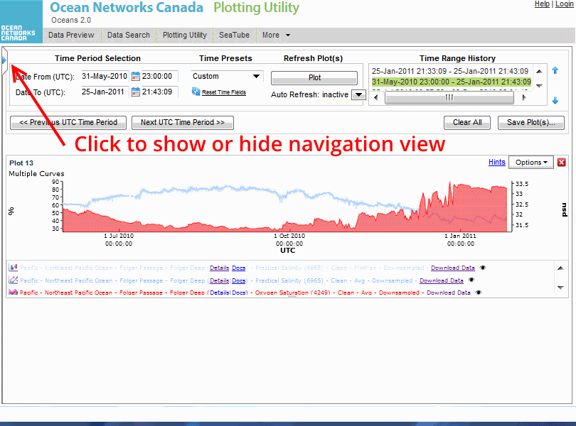
Click on the hide/show controller to hide the navigation pane and maximize plot size. In this example you can see summary information for the sensors over time. |