What is it?
Plotting Utility is an interactive plotting tool. Use it when you want to interact with your scalar data; zoom in, change from Min/Max to Min/Max+Avg or other plotting options, or stack multiple sensors in the same timeline. You can change from line charts to bar charts, filled area, and multiple Y-axis plots.
Why is this useful?
It's convenient (no downloads or specialized software required) and with an Oceans 3.0 account you can save your plots to your personal folder and share them with colleagues.
Click the available images to enlarge.
Register an Oceans 3.0 account & get more features
Personal history - remember searches, save plots, create annotations.
Share: send plots to colleagues and friends.
Community: join research working groups, share ideas for experiments and data analysis.

Plotting utility is arranged into three panes: on the left is the navigation and filter pane, on the top right is the time selection and plot history, and the bottom right is where plots appear.

This panel shows the three simple steps to create your first plot.
You can also choose data by date, and optionally auto refresh to watch live data streaming.

Multiple properties are available to plot at the same or different location and do some simple comparison.

Another way to compare your data is by overlaying plots. This shows that the selected sensor is overlaid on the previous plot.
You can access plot properties and make changes in the options dropdown.

Quality Assurance Quality Control is a process that flags all the data being collected by the instruments. This allows the system to identify the raw and clean data available in the database:
Raw data - populates the data collected without any modification.
Clean data - populates the data excluding those flagged with quality control failures.
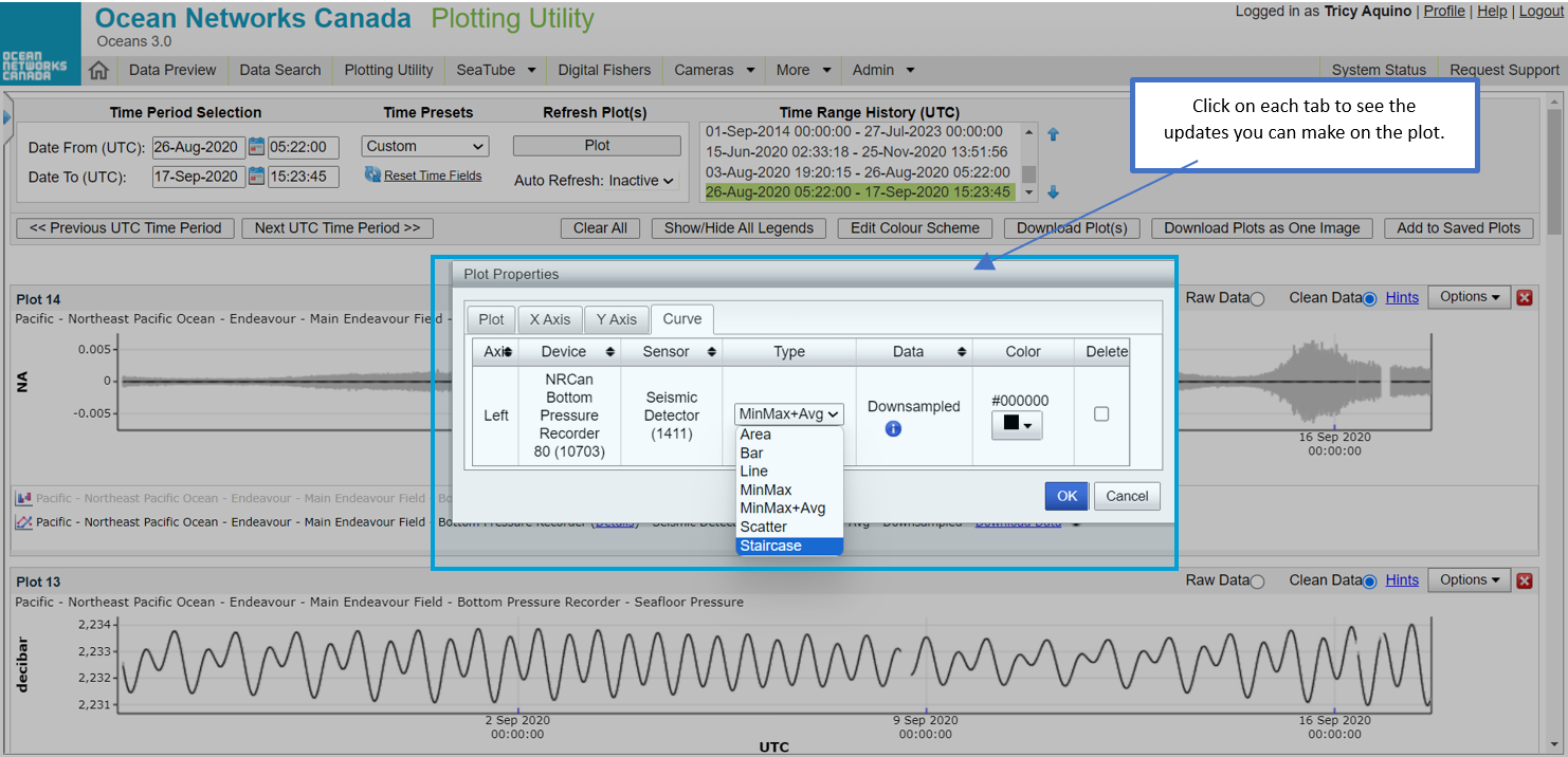 Plot properties allow you to do a more detailed update on the plot you are working on. Each tab contains field that you can manipulate.
The Curve tab gives you an option to choose different plot types and change the color.

You may take action to all the plots you created by using the buttons highlighted above.
Previous UTC Time period - goes back to the period available on the Time Range History box.
Next UTC Time period - goes to the next period available on the Time Range History box.
Clear All - clears out the plots created.
Show/Hide All Legends - shows or hides all the legends on the plots.
Edit Colour Scheme - allows to set the colour scheme for the plots.
Download Plot(s) - downloads all the plots in PNG format on a zip file.
Download Plots as One Image - downloads all the plots in one PNG format file.
Add to Saved Plots - saves all the plots on the Saved Plots tab available on the navigation pane.
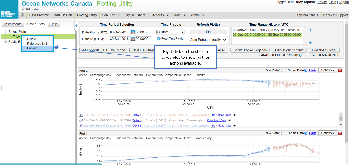
You may do further actions after saving your plots:
Delete - allows you to delete the saved plots.
Reference Link - allows you to copy the link address by right clicking on the Reference Link button and then "Copy link address".
Publish - allows you to share your plots publicly.
Try opening some saved public plots; there's some interesting stuff you can view and interact with.

Colour Scheme functionality allows the users to build their own schemes or use the preset schemes available. The default ones are designed to accommodate 3 different types of colour-blindness: protanopia, deuteranopia, and tritanopia.
The colours on each curve can also be edited by clicking on the colour block and choosing the desired colour. After the colours are updated, click the save button to apply the changes.
You may set this before you start creating your plots.
Only users logged in have the ability to edit the colour scheme.